
Signs act as an announcement for you and your businesses – and they are one of the most vital instruments you have to grab the attention of a consumer. What makes a well-designed sign even more powerful is that it can actually attract and engage a consumer who, prior to seeing the sign, may have never even thought they were interested in the goods and services you have to offer. Whether it’s at an exhibition, trade show, convention or something positioned on a highway or above a storefront, when considering sign design ideas, it is crucial you take into account the random passerby.
“Best Buy discovered that about 17 percent of its customers were people who did not intend to stop there but did so specifically because they saw the sign, which is well linked to their brand and overall marketing,” Sapna Budev, director of strategic initiatives for Alexandria, Va.-based International Sign Association, told Entrepreneur. “Who hasn’t been driving down the street, stopped at a store and made a purchase, merely because they saw the sign?”
To maximize the arresting nature of your signage, read on for a few innovative design ideas:
Make Color Your ‘Brand’
Color – as we’ve previously discussed – plays a big role in making your sign “pop” to a casual observer. But more than simply drawing the eye, different colors evoke distinct feelings, sensations and ideas – all which you can use to highlight aspects of your “brand.” Strong, eye-catching colors like reds, yellows and orange all speak in a coded language and have a visual power that goes well beyond simply what hue you’re looking at.
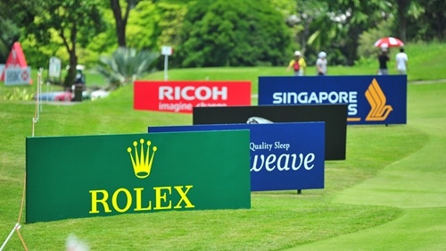
Think about the way that famous brands use colors. Most successful companies typically limit their palette and repeatedly use colors in a very specific way on their signage. This can be used to identify you as being a particular kind of company with certain values AND distinguish you from the competition. Soda brands Coca-Cola and Pepsi draw from a lot of the same fundamental colors, particularly whites, reds and occasionally black. Both companies use white lettering as well as black backgrounds to distinguish their diet offerings, but Coke has their classic vibrant red background while Pepsi uses blue to contrast.
When picking out your sign colors, consider what the fundamental values of your company are and what you want a person to know with a glance: Do you want to exude cool authority? Try blues and greens. Want to stand out as a bold innovator? Orange signifies a burst of energy and a capacity to challenge norms.
Contrast to Ensure Readability
Part of choosing your colors is creating strong contrast. White text on an off-white background will be difficult to read at any distance, particularly from farther away. Similarly, text imposed on a busy background could get lost.
“Most signs will include either text or graphics in the foreground, with a continuous background color,” Budev said. “The contrast between these two items is critical to the viewer’s retention of the content.”
 When it comes to signage, simplicity and clarity is crucial.
Establish Messaging Hierarchy
Depending on the application, you may have a variety of information you want to convey with your sign. In addition to the name of the business or organization, you may have a brand tagline, a short-term promotional element or location information. That can be a lot to process on one sign.
A sign loaded with text that is all the same font size can seem chaotic or difficult to read. Rather than parse it all out, most consumers will just walk on by and pay your sign no mind. To avoid losing a potentially valuable customer, think about the “hierarchy” of the information you want to impart. What’s the most important thing that you want a person to know with just a momentary glance? What are less important elements that you could impart later, after you’ve generated a solid lead?
Typically, the name of a business or organization is the thing you want a possible customer to remember. From there, they can choose to seek more information later. To ensure that your business name is a memorable feature of your sign, make it the largest element. Other features like a tagline or sale information should be made smaller – or left off the sign entirely for clarity.
Need signage for your next sale, exhibition or special event? Sign Art Etc has you covered. Call or email us today to get an expert’s help with all your sign needs.
 The most effective signs combine readable text with simple icons.