Seven Secrets Of Highly Effective Sign Design
There is a “secret recipe” for highly effective sign design. Just one missing ingredient will have a negative effect that can destroy the appearance of an otherwise well designed custom sign.
The good news is, designing visually appealing signs isn’t rocket science. Following solid principles graphic designers use to create attractive, high impact custom signage will help you yield the greatest return on your advertising dollars.
- Are ALL CAPITAL LETTERS Easier To Read?
- What Are The Very Best Letter styles To Use In Signage?
- What is “White Space” And How Can You Use It To Enhance Your Design?
- When Is Less, More?
- How Big Is Big Enough For The Message To Be Readable On A Sign?
- What Are The Best Color Combinations To Use?
- Should You Use A Border On Your Sign?
Use this information anytime to create a competitive advantage in your sign program. Let’s get started.
Secret # 1
Are ALL CAPITAL LETTERS Easier To Read?
There is a misconception that exists that since ALL CAPITAL LETTERS are “bigger” than their lower case counterparts, that they must be easier to read from a distance. However, visual tests have scientifically verified that Upper And Lower Case Text is more legible from a distance than ALL UPPER CASE LETTERS. Since passing motorists may only have 2-3 seconds to read your message, maximize the readability of your custom designed sign by limiting the use of all capital letters.
ALL CAPS do have a place in effective sign design. However, since you know now this secret, you will automatically be mindful if and/or when you choose to use them. When you preview a design for your new sign, stand back from the monitor to get a better idea of what the text will look like from a distance.
Top Secret # 2
What Are The Very Best Letter styles To Use In Signage?
In an attempt to stand out in the crowd, inappropriate type styles are often chosen for signage. “Designer Fonts” may look good on business cards and stationary, but they can greatly diminish the effectiveness of a sign. To make matters worse, fancy type styles are often used completely wrong.
For example, a
 on a sign can be difficult enough to read but nobody should ever use (“ALL UPPER CASE SCRIPT”) or

In general, clean, crisp, easy-to-read type styles should be used for maximum legibility. Prime distinctive examples include
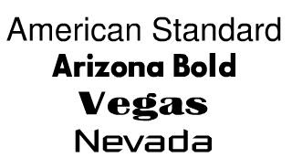 Variations of the same type style can also be used throughout the design
 If you look at what national companies do with their signage, you will notice clear, easy to read text in almost every case.
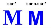
The second most legible group of type styles includes the serif style of fonts. Serifs are short horizontal lines added to the tops and bottoms of traditional typefaces, such as “Times Square” seen below. Please note the differences below between the block style letter (sans-serif or “without serifs”) and the serif style letter.
There are several variations of similar looking serif type styles including
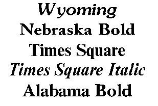 Each letter style has its own unique, defining characteristics. The distinctions from one serif letter style to the next are often subtle.
* As a general rule of thumb, never use more than two different letter styles in a single sign design. Our Online Sign Design Center let’s you instantly select, view and revise type styles at will. By playing with different styles and combinations, a distinctive identity will emerge that will project your business image professionally. Top
Secret # 3
What is “White Space” And How Can You Use It To Enhance Your Design?
White space also known as negative space simply refers to the empty area of a design that is devoid of any text or graphics. The empty spaces surrounding text and graphics are just as important as other design considerations. There is a tendency to “fill up” the available area with as much as possible. To leave area unused almost seems counterintuitive because we all want to get the most bang for our buck.
So why is white space so important to create highly effective sign design? Part of the reason is psychological and part of it is physical. Text without adequate white space leaves us feeling crowded and cramped. Text needs room to breathe. When text is crowded, the message becomes too difficult to read.
A general rule of thumb is that around 30% to 40% of the sign’s face area should be left as white space for optimal readability. Trust your own judgment. If a design looks too crowded, it probably is.
Secret # 4
When Is Less, More?
This design tip goes hand-in-hand with the effective use of white space.
The most successful sign will communicate effectively and concisely. Therefore, in as few words as possible, clearly communicate the message you wish to convey to your target audience. Crowding the sign with too many words or lines of text makes it increasingly difficult to read from a distance. The number of words used on a sign is a classic example of where, “Less Really Is More”.
Once you preview a completed design, stand back and look at it again and try to put yourself in your customers’ shoes. What will most appeal to them? Top
Secret # 5
“How Big Is Big Enough For The Message To Be Readable On A Sign?”
Any sign that can’t be easily read from the distance intended is virtually worthless. So when in doubt, better to go larger than too small.
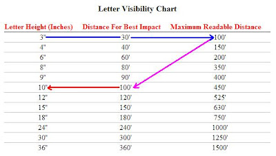
The scientific answer though lies in the Letter Visibility Chart originating from a joint research project by the Pennsylvania Transportation Institute, Penn State University and the United States Sign Council.
Unlike a lot of charts that seem confusing at first, this chart is very easy to read and understand at a glance. The beauty of this chart is in it’s simplicity of use.
For example, if the farthest point you want your message to be seen from is 100′, the Chart indicates that you should use a minimum 3″ letter height. However, for “Best Impact”, a minimum 10″ tall letter is called for. The greater the size, the greater the impact and legibility of the message.
 Selecting the right size lettering for your next project is no longer guesswork. Use the following steps to ‘reverse engineer” the exact size your sign should be. Working “backwards”, you can easily determine the optimal letter height for your signage. This will require a little bit of your time and effort but isn’t your business worth it?
- Start with the most distant point you want your audience to be able to read the sign
- It’s best not to guess so buy a cheap tape measure so you can accurately measure the distance
- Once you know the viewable distance, decide exactly what you want the sign to say
- As a rule of thumb, a 6″ tall letter will take up around 6″ in width. So if your line of text has 10 character spaces, you will need a sign at least 60″ plus in width. Remember to include enough white space around text and graphics when deciding upon the final size of the sign itself.
- If your sign has more than one line of text, add all of the vertical heights of the lines of text and add about a third more to that number for the height of the sign. For example, if all the lines of text add up to 12″ tall, add about a third or 4″ to make the overall height of the sign about 16″. Adjust as needed to make the layout look balanced.
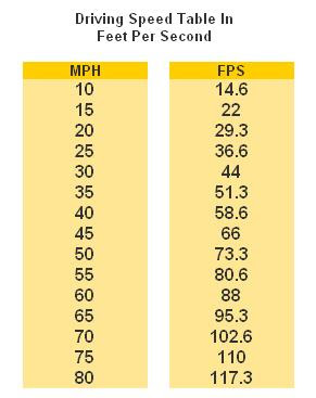 Speed is another factor that should be considered for signage visible from the street. The following chart outlines the feet traveled per second at different speeds. This is a supplemental tool you can use to help choose the optimal size for your custom signage.
Use the data in this table combined with the Letter Visibility Chart above to determine the amount of time potential customers will have to read a sign while driving.
For example, an 8″ letter is has a maximum readable distance of 350′. If a vehicle is traveling at 45 mph, then divide 350 feet by 66′ feet per second (FPS) to determine that a driver will have a maximum of 5.3 seconds to read the sign until they pass it.
You now possess the secrets to optimizing letter sizes that will be easily read by your target audience. Top
Secret # 6
“What Are The Best Color Combinations To Use?”
The effective use of color is vital to the effectiveness of a sign. So how exactly, do you use color “effectively”, right?
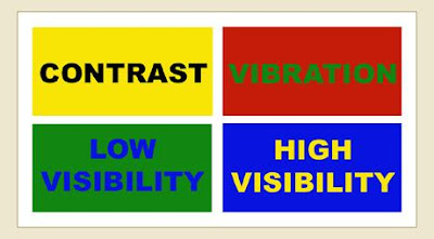
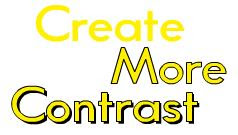
The key is contrast. So what exactly is contrast? Contrast is the difference in brightness between the light and dark areas present in a single design. A bright yellow background for example, will contrast well with dark letters such as black, a dark shade of blue and even purple. The greater the contrast or difference between the light and the dark colors, the more legible text is from a distance. Colors that are closer together like a medium gray letter against a black background won’t contrast as well and therefore will be more difficult to read.
 Contrast:
Take a look to your left. Which of the two looks larger… the white one? They are both the same size. The use of a light colored letter against a dark background lends to it seeming larger. Light letters tend to come at you, where dark tend to recede.
Generally speaking, white as a background color is by far the most versatile because more colors naturally contrast better against a neutral white background than any other single color. When you choose a different background color for a custom sign other than white, you limit your choices for colors that will both stand out and “go with” that background color. That’s not a good thing or a bad thing – it’s just something to keep in mind when making color selections.
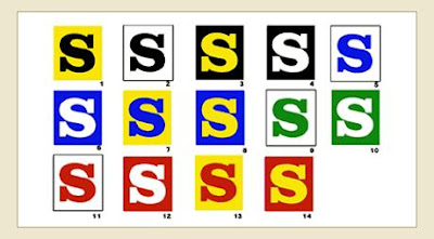
Comparing Visibility Of Different Color Combinations
These 14 color combinations for lettering were tested for readability at a distance. The test were carried out on different groups under the sponsorship of the Outdoor Advertising Association of America (OAAA). The results ranked in the sequence shown, with #1 the most legible and #14 as the least legible. Negative letters in 3, 4, 6, 8, 10, 12 and 14 appear to be larger in appearance than their positive counterparts.
 Color Combination Effects
 Contrast Solutions
Weak color contrasts can be strengthened with an outline and/or drop shadow.
Colors create a mood, a perception, a feeling and speak very loud to our subconscious generating either a positive or a negative reaction within seconds. Consider the psychological characteristics of color when making your selections.
BLACK suggests authority, power, boldness, seriousness, professionalism, is distinguishing and classic. Business wise, it’s great for creating drama and is good for a background color. It is ideal for text on a light background.
BLUE suggests security, authority, faithfulness and dignity. For business it suggests sanctuary and fiscal responsibility. It is the most popular and the second most powerful color. Blue can also be cold. People are more productive in blue rooms.
BROWN suggests richness, politeness, helpfulness and effectiveness. In business it suggests less important items. Solid, reliable brown is the color of earth and is abundant in nature. Light brown implies genuineness while dark brown is similar to wood or leather.
GRAY suggests authority, practicality, earnestness and creativity. Business wise it is traditional and conservative.
GREEN suggests health, fertility, freedom, freshness, healing, tranquility and jealousy. Businesses use it to communicate status and wealth. It is the easiest color on
the eye and can improve vision. It is a calming, refreshing color.
ORANGE suggests pleasure, cool, excitement, cheer, endurance, strength and ambition. For business it is good for highlighting information on charts and graphs.
PINK suggests femininity, gentleness, well being and innocence. For business you must be aware of it’s feminine links and implications.
PURPLE suggests spirituality, royalty, luxury, wealth, sophistication, authority and mournfulness. In business it is upscale and works with artistic types. It is also
feminine and romantic. However, because it is rare in nature, purple can appear artificial.
RED suggests excitement, strength, sex, passion, vitality, aggressiveness and commands attention. Business wise it’s associated with debt, is great for boldness and accents. The most emotionally intense color, red stimulates a faster heartbeat and breathing.
WHITE suggests refinement, purity, devotion, contemporary and truthfulness. For business it can be sterile and refreshing.
YELLOW suggests warmth, sunshine, cheer, happiness, jealousy, deceit and cowardice. Business-wise it appeals to the intellectual types and is a good accent. Yellow enhances concentration, hence its use for legal pads. It also speeds metabolism. It is the most difficult color for the eye to take in, so it can be overpowering if overused.
People respond more to non-verbal cues than verbal ones. Make sure you use the psychology of colors in all your marketing, especially when you can’t be face to face.
Secret # 7
Should You Use A Border On Your Sign?
 Adding a border increases reading speed by 26%. Borders are often recommended whenever automobile traffic is the intended audience.
With forethought and careful deliberation, present the image you want to project that will attract customers and entice them to stop, shop, and buy. For example, full-color photo-realistic digital pictures can be incorporated into designs to add greater impact. Logos, artwork and other graphical elements can also be added to visually stimulate the viewer towards the desired action.
Actively participating in the final design of your sign is an ideal opportunity to make the best first impression possible. Put your best foot forward. Nobody else knows your business and objectives better than you do. Nobody cares nearly as much about your success as you do. You are the architect of you business. Plan well.


