Category Archives: Vinyl Banners

Printing Full Color Banners on Vinyl


Most of us know what a “banner” is — not the kind used in web pages — but the kind used as signs on the sides of buildings, on fences, or across the stage at conferences. Roughly speaking, a banner is a large flexible sign or poster made of a durable material that can be easily folded or rolled. We are used to seeing banners strung across the road at fall fair time, or to promote a worthy cause.

In recent years banners or “banner signs” have become much more versatile than even five or six years ago. Banner signs are now used in all kinds of places where we used to see more permanent signs. Instead of a sign made of wood or aluminum, we now often see a vinyl banner sign that serves the purpose very adequately.

These days, the most common material used to make outdoor banners is smooth, good looking but durable vinyl. A banner printed on vinyl will stand up to the sun and rain for a number of years, so vinyl banners are often used in places where a quick, low cost alternative is needed.

The great advantage of banners is that they are made of flexible and lightweight material. That means a vinyl banner can be rolled up or folded when it is time to take it down or move it to a new location. They are also relatively inexpensive when compared to the alternatives.
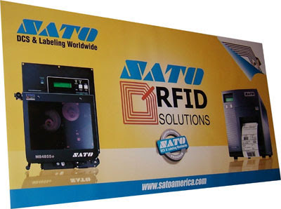
What has made vinyl banners so versatile is that they can now be printed digitally in beautiful full color. Printing vinyl banners used to be a fairly crude and laborious process, but the “digital revolution” changed all that. Special printing machines can now print directly onto vinyl that can be used either indoors or outdoors.

The design and printing process is actually quite simple — as long as you know something about digital printing. Banner designs can include photographs, artwork, fancy backgrounds, company logos. In other words, any graphic image that can be captured in a computer file can be printed on a vinyl banner.

All suppliers do not use the same process

The best place to find a source for vinyl banners is on the internet. A small number of companies specialize in providing low cost, fast-turn-around vinyl banners. A specialty vinyl banner company has mastered the details of banner printing and prints hundreds or even thousands of them every month. They can usually offer the lowest price and fastest delivery too.

But not all vinyl banner suppliers use the same process or the same equipment. Some use silk screening, while others use low end ink jet printers. The best suppliers use higher end UV ink printers. It is important to know the difference between these processes, and often you cannot tell by looking at the descriptions provided to you on supplier websites.

Silk screening has adapted some digital capabilities, but when it comes to the actual printing, it is still an older “low tech” process. It remains an important method of printing certain things that cannot be done “digitally” — for instance, for printing on unusual materials, or wherever special inks are required. But setup costs are normally higher, turn-around times are longer and printing smaller quantities is often not feasible.

Lower end ink jet printers are sometimes used to print on vinyl. But the bottom line is that these inks are meant for indoor applications and short term outdoor use. They are more quickly faded by UV from the sun, and are also susceptible to scratching and water damage.
Vinyl Banner Design Basics

Vinyl banner design is about as easy as it gets for the non-professional graphic designer. Anybody with a little bit of experience can design one. Using a bit of imagination can make a world of difference.

And even if you have no experience, your supplier can point you in the right direction, or even design your banner for a small charge.

Here are some things to watch for when designing a vinyl banner…

Vinyl Banner Design Tips # 1. Use software that handles CMYK full color output.

There are at least three kinds of software you can use:

— Image editors like Photoshop.
— Page Layout programs like Quarkxpress, Pagemaker, or InDesign.
— Illustration programs like Illustrator.

Generally speaking, programs that are designed for consumers or general office applications are not recommended: e.g., Word, Wordperfect, Publisher, Excel, etc. If you have a specific inquiry, don’t hesitate to ask your vinyl banners supplier. You can ask a design or production related question by using the contact form on any page on the site.


Design Tip # 2. Keep your design simple and striking.

The best designs for vinyl banners contain two or three basic elements. Usually these will be a photograph, a large headline, and an “identifier” such as your company name, logo, or phone number.

Design Tip # 3. Use bright colors.

The most striking vinyl banners have lots of bright colors.

Design Tip # 4. Design your banner so it is readable for your target audience.

If it is going on a building or beside a road on a fence, or on an outfield fence at a baseball, soccer or football field, MAKE SURE YOUR MOST IMPORTANT MESSAGE IS LARGE ENOUGH TO BE READ.

Design Tip # 5. Make sure your images have sufficient resolution.

For some advice on image resolution, see the Vinyl Banners FAQ.

Design Tip # 6. Make sure your banner fits the area where you’re going to mount it.

Don’t guess at the size. Most people who are not familiar with signage will UNDERESTIMATE the required size.

Design Tips for Effective Banner Marketing

Four Design Tips For Effective Banner Marketing

By its very nature, a vinyl banner is meant to be like a big flexible poster or billboard. That makes it a piece of advertising, so all the rules and techniques that apply to advertising design should apply to the banner as well.

Rookie Banner Design Mistakes

In the advertising business you see rookie advertisers making the same design “mistakes” over and over again. They think people are going to walk up to their poster, billboard or banner and examine every detail. So they cram it with lots of product information, a detailed map of how to get to their store, and the phone numbers of all their sales reps.

It comes as a bit of a shock to learn this is not how things work. In fact what happens is this: since we are bombarded with advertising images all day, every day, we do our best to ignore them. Especially the ones with lots of boring details.

It gradually dawns on the budding advertiser that what people DO notice is something striking, different, loud, funny, or shocking. That is why most professional advertising tries to create a distinctively memorable selling feature, and then focus on it with striking images, snappy, memorable slogans, or catchy, sing-able (often loud!) music.


Tip # 1. Keep it simple

The first, most important rule of thumb when creating a  design is to KEEP IT SIMPLE. Stick to two or three main elements that communicate your most important selling points. Identify your product with a striking photo (if you have one), and then define the most important selling features with the other elements: usually a striking headline, and some other “feature” like the price, the amount of discount, or the “free” thing you are giving away.

Tip # 2. Use Striking, Colorful Elements
— the “Photo ID Model”
Of course these days we are talking about vinyl banners made with FULL COLOR digital printing. So when creating your vinyl banner design, it is usually safe to use what I call the “Photo ID Model” for digitally printed state-of-the-art vinyl banners. The “Photo ID model” uses four basic elements:

  1. Product photo or photo collage
  2. Main Headline
  3. Product Description
  4. Company Identifier

The Photo ID Model is not the only design style you can use for your vinyl banner, but it gives you a professional looking, highly effective place to start. For a more complete description of this design approach, see my article titled “The Photo ID Advertising Design Model”


Tip # 3. Use Color Effectively

Use COLORS to your advantage. Use FULL COLOR PHOTOGRAPHS that contain interesting bright colors. And make your headlines, special offers, and company identifiers jump out by using red, white or yellow on a black background.
This is called the “reverse text” or “knock out” technique. Look at the hundreds of signs you see everyday, and notice how often reverse text is used. The contrast between the light colored text and black (or dark) background gives your text much more graphic impact.


Tip # 4. Use Your Imagination. Be Creative!!!

Unfortunately the “Photo ID Model” is so effective — so obvious — it is very tempting to use it without thinking much about the IMPACT or CREATIVITY of the various elements. So for instance, a typical vinyl banner or other type of display ad for a fictitious company called “Perk-it-Up Coffee” will often start out like this:

“Perk-it-Up Coffee” (headline)
Photo of can of coffee (photograph)
“Made from the finest coffee beans, blah, blah, blah.”
Order yours today from Perky People Coffee, 123 Java Hwy

Notice how this list is just a series of relatively unimaginative “facts” about the product: the product name, what it looks like, how it is made, where you get it. Not terribly inspiring. No clear statement of its most important features. No attempt to “sell” the product.

You can do much better than that! With a little bit of imagination your “Perk-It-Up” vinyl banner could have MUCH MORE IMPACT. For instance, even a fairly uninspired headline like the one above will come to life if you associate it with an interesting photograph.

And I’m not just talking about a picture of the product. Use good looking people if you can. For example, a photo of happy, wide-eyed person holding a “Perk-It-Up” mug looking as though she just had a major java hit. Now even a boring headline like “Perk-It-Up Coffee” means something. And now you can go the next step and be more creative with your headline too!

Keep it simple, make it striking, use color effectively, and be creative. Then your vinyl banners will have the impact you are looking for.

10 Vinyl Banner Design Tips For Advertising

Vinyl Banners are a simple cost effective way to promote your business.

1. What will your banner be used for?

Banner advertising is very versatile and can be used inside, such as in shops, offices or museums; outside shops, restaurants and on buildings; for exhibitions and trade shows and at sporting events and concerts. Outside banners need to be more durable and weather resistant than indoor ones.

2. What is the aim of your banner?
Your banner can be used to advertise many different aspects of your business. What about promoting a sale, the opening of your new business, increased opening hours at your shop or café, a new product range or new season stock in your shop; a live band playing at your pub; the fact that you now serve food in your museum, or are launching a new product at a trade show?

3. What needs to be on your banner?
Depending on the aim of your banner, you may need to include the message, phone number, website address, corporate slogan and logo. Or you may only need basic information such as Sale Now On, Car Park Next Left, Under New Management, or Now Open Longer.

The banner will need to contain just enough information to convey your intended message. Too much information and people will be put off, and if there’s not enough information people will ignore it or not know what to do.

4. How big does it need to be?
If your banner is too small it won’t be easy to read. If it’s too big it might be overpowering. Consider the amount of space that the banner will take up, and measure carefully.


5. What shape should it be?

The shape will depend on placement. Long and thin banners work well for down buildings such as a pub or restaurant, whilst short and wide are ideal for above a shop, and perhaps you want square banner for a concert or sporting event.

6. Who will design it?
If you are a creative type of person, you could design a vinyl banner yourself, and it will be cheaper than employing a designer to do it for you. Using an experienced designer will ensure that your banner will be appropriate for printing, and will be more professional than using clip art and a compromised font, from a word processing package.

7. Are the images clear and obvious?
Images and artwork that look clear on a piece of paper may not be as obvious once the artwork has been turned into a banner. Are there too many colors or not enough?

8. Is your banner easy to read?

Will somebody driving past be able to tell what you are promoting and know what to do? Can someone remember the website address or phone number? Will somebody walking past be able to as well? That font might look good to you, but is it easy for your intended customers to read.

9. Are there too many colors?
Whilst you may be tempted to make use of all the colors available to get even better value for money, your banner will be easier to read if you keep the colors simple.

10. How will your banner be attached?
Often overlooked, how the banner will be attached is arguably just as important as the design of the banner. The popular choice is to use metal eyes so that rope or elastic cord can be used to easily hang the banner. Internal banners will not be subjected to wind and movement the same way that external banners will be. If you are able to use existing railings, or shop fixtures to hang your banner on, you can then decide which method of attaching will be best. Perhaps you will need to use additional fixing methods, or make alterations to the building structure.

Want to advertise your business to passing traffic? Need to let people know your restaurant is open longer? Want to tell people you’ve got a sale on? Then use banner advertising and let your customers know. Get a vinyl banner printed today.

Custom Church Banners

Bulletin boards are a good venue to post church news, announcements, reports and updates. But not all people read bulletin boards. They may be cluttered and contain a lot of old news mixed in with the news. Sometimes, important notices are overlooked or don’t get the attention they need.

When you have to announce something very important, do it with a custom banner posted on the church’s façade to everyone to see. As church announcements are relatively simple, a banner wouldn’t cost much. Parishioners will learn more about your activities and are more likely to participate.

For special occasions, like a Christmas play, anniversary or a visit from a senior church official; spread the feeling of welcome and joy by hanging a colorful announcement banner. You can have one done on vinyl in full colors, attractive images and catchy text that will add a touch of professionalism to any church announcement you may have.

Church banners can carry photo quality images and backgrounds that attract and bring attention to your project or event. You can have it designed in such a way that drivers and pedestrians will see it across the street. They are the perfect welcoming sight for your important guests, as they do convey hospitality and warmth. A vinyl banner is waterproof, fade resistant and will last a long time. You can use it for church signage as well. You can print church schedules and list weekly or monthly activities. Better informed parishioners can and will contribute to your cause.