Color As A Medium Of Communication
One of the most important considerations in the creation of a sign revolves around the effective use of color. Color can convey emotions and elicit feelings. Red signifies life and passion. Blue gives the feelings of coolness and calm. Green connotes growth and springtime, and yellow says warmth and vitality.
Color Frequency and Vibration
Like sound waves, light rays have varying wavelengths or frequencies: the lighter the color, the higher the frequency. These wavelengths determine perception of color. Some pigments absorb certain light frequencies and reflect others. We see the reflected frequencies as color. Complementary colors such as red and green are not readily legible. They have similar black and white value, so their wavelengths set up a vibration. Any combination of colors of similar value, even without vibrating, will have low visibility. Although yellow and purple are complementary colors, they have strong contrast in value and therefore little vibration. They provide maximum visibility.
Comparative Visibility Of Full Value Color Combinations
These 14 color combinations for lettering were tested using only primary and secondary color of full hue and value. Tests for readability at a distance were conducted on different groups under the sponsorship of the Outdoor Advertising Association of America (OAAA). The results ranked in the sequence shown, with #1 the most legible and #14 as the least legible. Negative letters in 3, 4, 6, 8, 10, 12 and 14 appear to have a broader stroke than their positive counterparts.
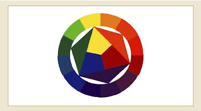
Color Wheel
The color wheel is divided into three categories: primary, secondary, and tertiary. The three primary colors are red, yellow and blue. These three are the foundation of all colors because they are used to create each and every color. When you combine two of the primary colors, you create the three secondary colors. The secondary colors are orange, green and violet. The six tertiary colors are created by combining a primary and an adjacent secondary color. The six tertiary colors are red-orange, red-violet, yellow-green, yellow-orange, blue-green, and blue-violet.
Color Temperature
Colors are also divided into categories by temperature feel. These are considered cool and warm colors. The cool colors are green, blue and violet, while warm colors are red, orange and yellow. Psychologically, the colors give the viewer the feeling of these temperatures.
Color Schemes
Related Schemes
Monochromatic: This color scheme uses a single hue. ( example: red and its varying tints and shades)
Analogous: The scheme uses adjacent hues. (example: red, red-orange, and red-violet)
Contrasting Schemes
Complementary
If two hues are opposite each other on the color wheel, they are considered to be complementary colors. When used together in a design, they make each other seem brighter and more intense. This is not always a good thing, however, as colors, such as red and green tend to make each other too intense and vibrate against each other. This can make for difficult reading.
Split Complementary
This color scheme uses three colors: any hue and the two adjacent to its complement.
Triadic
This scheme also uses three colors. They are evenly spaced from each other.
Discordant Schemes
Double Complement
This color scheme uses two pairs of complements.
Alternate Complement
This scheme uses four colors: a triad and a complement to one of the hues.
Tetrad
This scheme uses four colors evenly spaced on the color wheel. A primary, secondary and two tertiary colors are used.


