Category Archives: Sign Design

Fall weddings can be beautiful and inspired.

Fall wedding themes (that won’t remind people of Halloween)

The fall can be a lovely time to host your wedding ceremony: The air is crisp but not yet cold, the leaves are turning brilliant shades of red, yellow and orange, and people have settled in after returning to school.

Many fall weddings, however, fall into the trap of taking the season painfully literally. In response, you can see lots of pumpkins, orange decor and foliage inspired designs. This can end up making your wedding look more like a neighborhood Halloween party than the beautiful, memorable event it should be.

To avoid some of the more humdrum aspects of fall wedding designs, consider these unique and inspired themes:

“Many fall weddings take the season painfully literally.”

Autumn harvest
Rather than skewing toward Halloween with bright oranges and dried leaves, why not soften your color scheme with more earthy tones and wheat and moss centerpieces? Try a theme that is loosely inspired by a Thanksgiving family gathering, emphasizing a harvest bounty – and thus implying that your union will be bountiful as well.

While pumpkins are a traditional part of a harvest spread, don’t feel limited to them. Squash, candles, straw, wheat and sunflowers are all features of the season and will look at home spilling out of cornucopia centerpiece. Wheat, in particular, can give your design a rustic and seasonal chic, while adding decorative sprig to your place settings can be a cost-effective way to bring sophistication. Consider having a customized backdrop for photos placed behind a beautiful ivy frame.

A lovely ivy covered backdrop can be a beautiful reminder of the season. A lovely ivy covered backdrop can be a beautiful reminder of the season.

Back to school

A whimsical and nostalgic design concept that takes advantage of the season, a back to school theme can be accomplished by integrating apples, your favorite books and other school-age accouterments into your decorations. When feeding your guests, try a buffet of sandwiches and finger foods wrapped in wax paper to evoke that “lunch pail” sensation.

Apples can act as table numbers or photo holders, small chalkboards used to designate seating arrangements, and stacks of books tied up with ribbon can be positioned as centerpieces. These chalkboards can also be used to write best wishes and humorous captions for guests to hold up when having their pictures taken in front of the backdrop.

Fall foliage
While this is often a feature of more traditional, less-inspired wedding themes, using the color scheme of fall in unique ways can prove extremely flexible. Rather than just gathering red and orange leaves and leaving them scattered all around, spray paint dried leaves gold or bronze and hang them as DIY mobile, faux chandelier or place them on tables as setting decoration.

Additionally, if you want to use the color scheme of fall without it seeming like you just raked up your yard, try using peachy orange colored flour wreathes or Delilah centerpieces. These flowers evoke the feeling of autumn while still being vibrant and lively since they are in season. The same is true of chrysanthemums and asters.

Furthermore, you can take fall foliage in unexpected ways. Instead of traditional orange pumpkins, try white pumpkins wrapped in berries. Integrate maplewood into your designs. Still, if you are using natural touches in your decorating, be mindful of your guests’ possible allergies.

Your wedding should be a unique expression of your love and joy. Whatever you choose for your theme, Sign Art Etc. can design a beautiful backdrop to ensure that your photos become cherished memories.
Make your startup launch party a hit with ideas like a customized backdrop for photo taking.

Throw the perfect startup launch party in 3 simple steps

Having a launch party for your startup is a great way to announce to the world that you’ve arrived in style and panache. Unfortunately, in those crucial few months of existence, money and resources can be tight and time to plan is limited. With that in mind, here are a few simple and inexpensive ideas to make sure your launch party is a hit:

Define your objective
Before you even announce the party and send out invites, talk openly about what the objective of this event will be. Is it simply a way for staff to blow off steam after a difficult and stressful beta run? Are you hoping to raise brand profile via media exposure? Are you looking to attach and gather new sales leads? By working to identify what you hope to get out of it, you can narrow down the decor, what kind of venue you will need and who will be invited.

“The goal of this party is to celebrate your newly-minted company.”

Right-size your venue
The office break room isn’t going to cut it when the goal is to make your launch an event. Look for a venue nearby that will easily accommodate all your guests, but not be too big so as to seem under-attended. Also, plan for areas that will be devoted to food and beverage stations, games and other entertainment.

Hire help
I know it may be tempting to keep everything in house to save money, but remember that the goal of this party is to celebrate your newly-minted company. It’s hard to point to your achievements if you’re stuck handing out hor d’oeuvres and mixing drinks. In the end, hiring a party planner is a worthwhile expense and may even save you money by limited the possibility of over-ordering food and beverages.

Looking to make your launch more exciting? Get a backdrop from Sign Art Etc! You can choose from one of our many pre-designed templates, or for something a little different our design team will help you create the perfect custom design just for you. Visit us today to learn more about what we have to offer.

Step and repeat backdrops can be hard boards or more traditional banners.

Boards versus banners: Which is right for your event?

When it comes to designing and ordering a backdrop for your upcoming event, you have a great deal of options. These products are customizable, so you can make a lot of changes to the design and the structure to make sure they work for you.

One question that we get quite a bit is whether a simple banner is good enough, or if it’s worth investing in a board as well. The board refers to a hard, plastic foam-core backdrop, as opposed to the softer vinyl or fabric banner that most step and repeats are made from.

Boards
For a more “permanent” setup, you can order a hard board that can be attached to a wall. The images are printed on vinyl sheets, which are then hand-laid onto the hard backdrop. This is ideal for press conferences and other events where you need an absolutely perfect wall for your pictures. It’s also great if you have regular red carpet events at the location. These boards start out at 5 feet wide and 8 feet tall, but they can be made over 100 feet wide if needed.

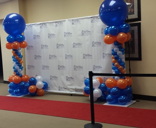
Step and repeat backdrops are available as banners or as stiff boards. Backdrops are available as banners or as stiff boards.
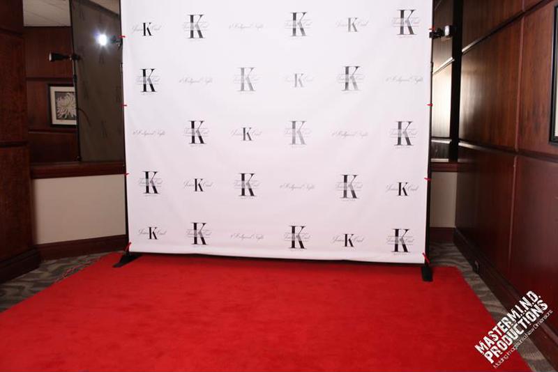
Banners
A traditional vinyl or fabric banner is the most popular option, since it’s so versatile. These banners are equal to the boards in terms of print quality, but because they aren’t attached to a hard surface there’s the possibility for some wrinkling. However, they come with a system that keeps them tight, so wrinkles are kept to a minimum. These banners are great for “pop-up” events where set up is for a limited time.

Whether you’re looking for a board or a banner, Sign Art Etc has got it covered! We ship backdrops anywhere in the U.S., and our dedicated team is ready and waiting to help you design the perfect solution for your event. Contact us today to get started.

Step and repeat banners come in many sizes and design styles.

What to Look for in a Step and Repeat Design

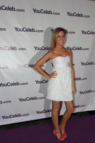
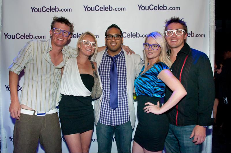
A step and repeat design can provide a quality backdrop for a wide range of events, such as birthdays, weddings, product launches and charity galas. If you’re ordering a custom backdrop online, it’s best to have a basic understanding of what to look for in these products, so you know you’ll have the best banner for your event.

Materials
Most are made from either vinyl or fabric. While vinyl is a more affordable option, the shiny nature of the material can give back more of a glare in some photos. This can also depend on the overall design of the banner and the lighting of the venue. Vinyl can also wrinkle a bit.

Fabric, while more expensive than vinyl, will not give off any glare. In addition, this material won’t wrinkle at all.

Step and repeats can be made from fabric or vinyl. Step and repeats can be made from fabric or vinyl.

Design
Custom backdrops can include repeating logos like a traditional step and repeat, or one large image that takes up the whole banner. The ink that you use can reflect the flash back in some situations, depending on the material. The more white space you have, the less likely this will happen, since the ink is more reflective than the backdrop.

How big should the logo be?
For customers creating a step and repeat with the standard series of repeating logos, you want to make sure the logos are the right size, particularly for group shots where the camera will be at a farther distance. The typical size of a logo should be between 9 to 11 inches wide or for more boxy logos, 5 to 7 inches tall.

For professional printing, customized designs, affordable pricing and quick turnaround, visit Sign Art Etc! The Sign Art team is ready to design and create the perfect custom banner for your event.

Consider Your Readers: Choosing The Right Sign For Optimum Visibility

The title may seem obvious, but if you perform a tour through your local community and take a studied approach, you may be surprised at how many signs and advertisements are nearly INVISIBLE. The reason being that someone didn’t consider the impact of the sign in relation to its environment, rendering the effect of their marketing efforts null and void.

This does not need to happen, and if you consider a few basic guidelines ahead of time, you can increase the effectiveness of your ad many times over.

Such factors to consider include:
Color
Shape
Font
Complexity of Design
Background / Environment
and Size

When thinking about banner printing, consider the the type of traffic involved. Is your message intended to reach drivers at highway speeds, city speeds, or pedestrians? Perhaps even all three at the same time?

Have you ever watched a movie on your home television and realized as the end credits roll by that there is no way you could ever read them, if you wanted to, at that fast speed and at that tiny font size? The same principle applies to your banners and signs. One very basic factor to take into account is size — both the overall size of your banner and the size of any copy on the sign. Here’s a simple visibility chart to give you some idea: